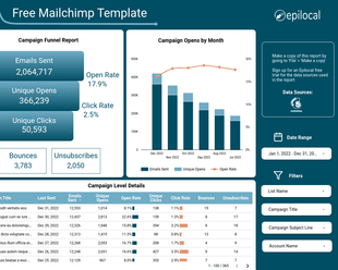
We’re big fans of Google Data Studio as a free tool that makes it easy for small businesses to centralize all of their analytics and reporting. The ability to create intuitive dashboards gives it a big advantage over more fixed options like the reporting capabilities that come with Google Analytics.
Further, the ability to pull in data from multiple sources using custom connectors, makes Data Studio a powerful tool to get insights from your data. In this article, we will look at how you can combine data from Google Analytics and Mailchimp to create the ultimate dashboard that gives you answers to valuable questions about your readers and newsletter subscribers.
After following this step-by-step guide, you will easily be able to answer questions like:
- Which subject lines get my reader’s attention?
- What days of the week are the best to reach my subscribers?
- How much traffic from my website comes from my newsletter subscribers?
And not only that, but you will have a visually appealing dashboard that gives you the most important Mailchimp metrics in a single glance.
Here’s what our dashboard will look like after we are finished:
If this guide gets over your head or you would simply like to get started right away, you can grab the finished template for free here.
With that being said, let’s start building.
Make all of the Connections
First, we need to get all of our data sources connected. Keep in mind, we have three tools we are working with: Data Studio, Google Analytics and Mailchimp, and each one needs to be connected to each other.
Visually our connections will look something like this:
Google Analytics and Mailchimp obviously need to be connected to Data Studio so we can build dashboards using their data.
Then it is easy to overlook, but we also have to connect Mailchimp to Google Analytics. By doing this, Google Analytics can recognize which traffic comes from our Mailchimp campaigns.
Connecting Google Analytics and Mailchimp to Data Studio
In order to bring data into Google Data Studio, we must use what are called “custom connectors”. Custom connectors are essentially pipes that move data from their source to our Data Studio report. Data Studio has a built-in connector for Google Analytics so that is already done for us.
For Mailchimp, we have developed our own connector that is one of the easiest to use and most affordable on the market. You can read all about how it compares to other connectors and how to set it up step-by-step here. But in short, the setup is as follows:
- Grab your free trial of our connector here
- Add the connector in Data Studio as a new Data Source
- Follow the configuration prompts to link your Google and Mailchimp accounts
Connecting Mailchimp to Google Analytics
We have to connect Mailchimp to Google Analytics so it can start tracking email traffic that comes from Mailchimp campaigns. This can be done with a couple of quick steps outlined on the Mailchimp website here. But essentially, what you need to do is:
- Go to Integrations in your Mailchimp account and add Google. This will prompt you to login to your Google account to give Mailchimp permission to link it.
- Then in the Settings & Tracking section of any new email campaigns, check the box that enables Google Analytics link tracking
- Finally, enable the same checkbox for any Automation sequences and additionally you will want to make sure that the titles for all of the emails in a sequence are unique. (otherwise we won’t be able to split out the traffic that comes from each email in Google Analytics)
Set up the Data Studio Report
Now that we have all of our connections made, we can start building our report in Data Studio.
There is a bit of initial setup that is required due to the way that our data comes from Mailchimp. Since Mailchimp does not allow us to combine data for Campaigns, Automations and List Growth, we must add these as separate data sources in our report. Then once we have done that, it will be easy to create report elements using these sources.
To do this, we will go to Resource > Added Data Sources, we will click “Add a Data Source” and we will select our Mailchimp connector. The connector will be give us the option to select Campaigns, Automations or List Growth.
You can start by selecting Campaigns, and after clicking Connect you will see all of the fields that are associated with Mailchimp campaigns. Let’s call this data source Mailchimp Campaigns, so we can easily recognize it later.
Next we will just want to repeat this same process for Automations. So you will select “Add a Data Source” again > select the Mailchimp by Epilocal connector > then select Automations > and name it Mailchimp Automations. Finally, you will do the same for List Growth.
While we are adding our sources, let’s also connect our Google Analytics account. Here you will again select “Add a Data Source”, but now instead of selecting the Mailchimp connector, you will select the Google Analytics connector.
The process to set up the Google Analytics connector is very straightforward, just select your Account, Property and View. If you are unsure of these values, you can find them by logging directly into your Google Analytics and viewing your settings.
Once you have all of your data sources are set up it should look something like this:
Great, now we are all set up and ready to start building our report.
List Growth
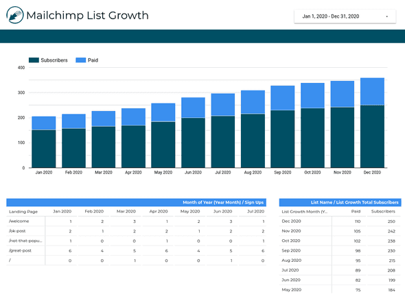
The first page in our Mailchimp Data Studio report will be all about List Growth. Here we will be able to see quickly how our different lists are growing over time as well as the content that is driving the most sign ups.
When we are finished, we will have something that looks like this:
For the purposes of this article, we won’t go into the styling of the different elements - we will just look at how to set them up to get the data flowing.
First, let’s look at our chart. We will start by going to Insert > Column Chart and clicking somewhere on the report to insert it.
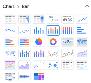
Next, we will change the chart type to a Stacked Column Chart. You can do this by clicking on the chart and then clicking in the toolbar where it says Chart > Bar. You will then select the box for Stacked Column Chart.
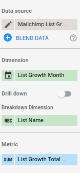
Now that we have the chart we want, we need to hook up our data. Under Data Source, thanks to our setup we did before we can simply select Mailchimp List Growth. This will make all of our List Growth data fields available to us in the Available Fields column to the right.
With these fields, we can now configure the data for our chart:
- Dimension will be the field “List Growth Month”
- Breakdown Dimension will be “List Name”
- Metric will be “List Growth Total Subscribers”
This is a good time to add a date range so we can control the chart’s time period. Let’s go to Insert > Date Range Control and click in the upper right corner of the report. By default, this date range will control the time period for any charts or tables we have on the page, which is exactly what we want - so we don’t need to configure it any further.
To test it, you can select Last Year and you should see 12 month’s worth of list growth data in your chart. (assuming you have lists that are at least a year old)
Note that Mailchimp only provides List Growth data by the month, so changing the individual dates will note impact the data. As long as you have selected at least one day in a month, it will return the List Growth data as of the end of that month.
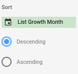
Finally, let’s just make sure that our months are displaying correctly on our chart, so we will look at Sort and make sure it is set to List Growth Month and “Descending”:
With our chart done, let’s move into the table in the bottom right corner. Here we will be using the same data as our chart, but we want to present it in a Pivot Table so we can see the data in a bit more detail.
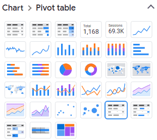
So we can start by copying and pasting our chart, and then we will go to where it says Chart > Bar and select the Pivot Table:
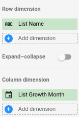
Now we just need to flip our Row and Column Dimensions so we will have our months across the top and our Lists going down the side:
- So now our Row Dimension will be “List Name”
- And our Column Dimension will be “List Growth Month”
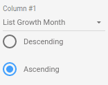
Then just make sure everything is in the right order by going to Sorting and Column #1 - make sure it is set to “List Growth Month” and “Ascending”.
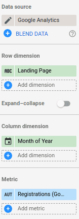
Lastly, to finish off our List Growth page, we will create a new Pivot Table that shows Google Analytics registrations by Landing Page. We can go ahead and copy the Pivot table that we have, and we will change the following:
- Data Source will now be set to “Google Analytics” (this will change our available fields)
- Row Dimension will now be set to “Landing Page”
- Column Dimension will be “Month of Year”
- Metric will be “Registrations (Goal 3 Completions)”
Note, the Registrations metric requires Goals to be set up in Google Analytics. You can follow our guide here to see how to do it.
Campaigns and Automations Summary
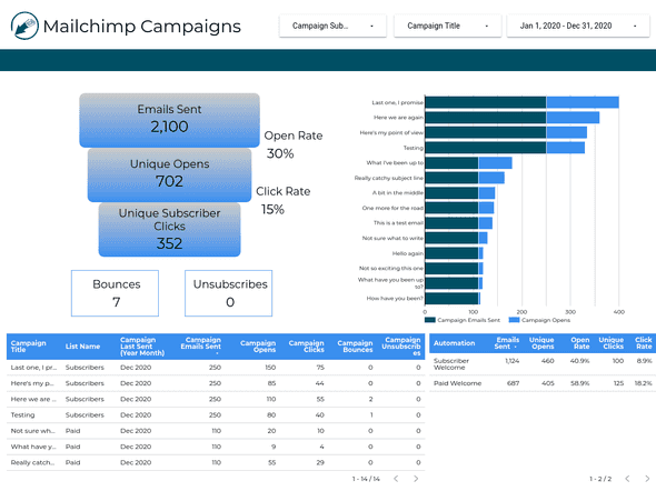
Next up, let’s summarize all of our Campaigns in one nice view:
With the data that we will have on this page, we will be able to quickly see all of our Campaigns aggregated together, breakdowns for performance by individual campaign, and all-time stats for our Automations.
Let’s start by adding a few drop-downs at the top:
- Date Range: so we can control the time period for all of our charts on tables on the page
- Drop-down List with the Control Field “Campaign Title”: this will let us filter the entire page by Campaign
- Drop-down List with the Control Field “List Name”: so we can also have the option filter our charts and tables by List
With that out of the way, let’s start building our funnel in the top left of the page. This is done entirely using Scorecards, which simply show one Data Studio metric at a time.
So we will go to Insert > Scorecard and click on our report. We also need some labels for our scorecards, so let’s also go to Insert > Text and put it next to our Scorecard. Now let’s repeat this 6 other times to end of with a total of 7 Scorecard and Text elements.
Now we just need to select the data source and metrics for each one. This time, our data source will be Mailchimp Campaigns and our metrics will be the following:
- Campaign Emails Sent (label: Emails Sent)
- Campaign Unique Opens (label: Unique Opens)
- Campaign Subscriber Clicks (label: Unique Subscriber Clicks)
- Campaign Open Rate (label: Open Rate)
- Campaign Click Rate (label: Click Rate)
- Campaign Unsubscribers (label: Unsubscribes)
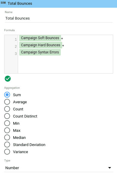
For Bounces, we need to create a custom metric that adds together Soft Bounces, Hard Bounces and Syntax Errors. We can do this by selecting our Scorecard element and clicking on the left part of it. (you will see a pencil icon when you hover over it)
This opens up the Custom Field window where we can enter our own formula. So let’s call this field “Total Bounces” and the formula should be: Campaign Soft Bounces + Campaign Hard Bounces + Campaign Syntax Errors.
Great! Now we’ve got all of the data fields for our funnel. Let’s move on to the table below it.
This table shows us the details for all of our campaigns. It’s really easy to set up, we just need to go to Insert > Table, set the data source as Mailchimp Campaigns and add the following dimensions:
- Campaign Title
- Campaign Last Sent
- List Name
- Campaign Subject Line
Then we will add the following metrics:
- Campaign Emails Sent
- Campaign Unique Opens
- Campaign Unique Clicks
- Total Bounces (you will need to create this as a custom field again, same as we did before)
- Campaign Unsubscribes
You may run into some formatting issues from the long headings, so you can change those by clicking in the same place that you created the custom field. (only you will not be touching the formula section, just the title)
Next, let’s tackle the chart in the top right corner which breaks down each campaign by title and displays some key stats like Emails Sent and Opens. We will go to Insert > Column Chart and change our chart type to Stacked Bar Chart.
Then we will set our data source as Mailchimp Campaigns and the following data fields:
- Dimension: Campaign Title
- Metrics: Campaign Emails Sent, Campaign Unique Opens, Campaign Subscriber Clicks
- Sort: Campaign Title
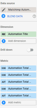
Now to finish off this page, we just want to add the Automations table in the bottom right corner of the page. We can just go ahead and insert a new table and add Mailchimp Automations as the data source.
You will see new data fields available now that correspond to the Automations data available from Mailchimp. One thing to note about this data, is that it is not linked to dates in the way that Campaigns or List Growth is, so we can only do a table of all-time total values. Unfortunately,it limits what we can do but at least we can compare our Automations against each other.
Let’s do that for this table - so we will add the following dimensions and metrics:
- Dimension: Automation Title
- Metrics: Automation Total Emails Sent, Automation Total Unique Opens, Automation Total Open Rate, Automation Total Clicks, Automation Total Click Rate
And that’s it for our Campaign and Automations summary tab.
Campaign Insights
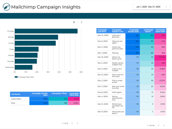
On the third tab of our report, we will drill a bit deeper into our Mailchimp campaign data to help us extract further insights about the performance of our campaigns.
Open Rates by Day of Week
First, let’s build a chart that helps us compare open rates depending on the day of the week. We can go to Insert > Column Chart and then we will change the chart to the type “Bar chart” to make the bars go horizontal.
Then we will select our chart and add Mailchimp Campaigns for the data source, select Campaign Last Sent as our dimension and then Campaign Open Rate as the metric.
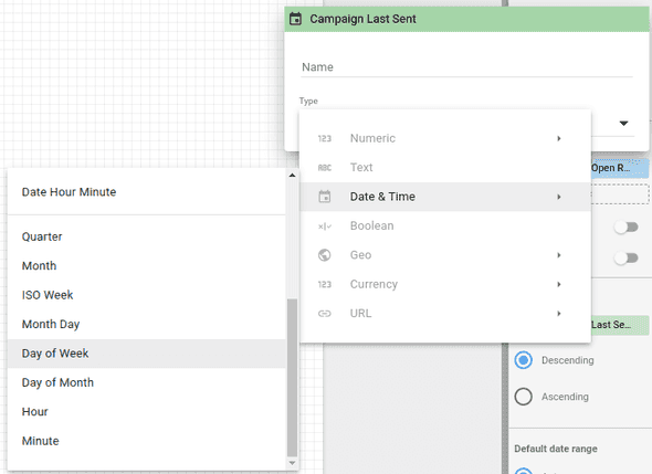
Now, similar to when we edited our custom field in the past, we will click on the left part of the “Campaign Last Sent” dimension. Here we will then select the dropdown menu that says Type, and then we can select Date & Time > Day of Week.
And that’s it - now we can see which days of the week get the best response from our readers.
Click Rates by List
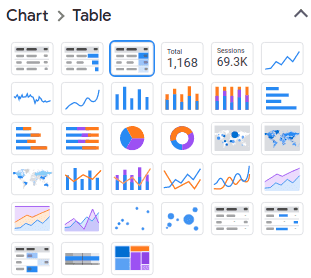
Now let’s create the heatmap underneath that chart, that compares the click rates for our Lists. To do this, we will first create a new table by going to Insert > Table. Then we will change the type of table to “Table with heatmap.”
This gives us all of our formatting ready to go, so we just need to fill in our dimensions and metrics that same way we would for our regular tables. So we will choose Mailchimp Campaigns as our data source and then the following dimensions and metrics:
- Dimensions: List Name
- Metrics: Campaign Emails Sent, Campaign Unique Clicks, Campaign Click Rate
Subject Line Open Rates
Then we can easily do the same for our other pivot table on the page that will compare the open rate of different campaigns based on their Subject Line. So let’s just copy our heatmap table over and change our dimensions and metrics:
- Dimensions: Campaign Subject Line, List Name
- Metrics: Campaign Emails Sent, Campaign Unique Opens, Campaign Open Rate
And with that we have our Campaign Insights tab done. This just gives you a small taste of the level of detail you can drill into - there’s lots of other insights you could extract from your Mailchimp campaign data.
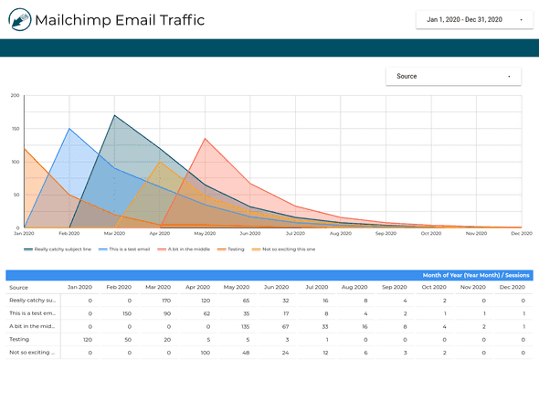
Email Traffic from Mailchimp
On our last page of our report, we will be tracking the email traffic that comes to our site from our Mailchimp campaigns.
Let’s start by inserting a new chart and changing it to type “Area chart.” Then we can select our data source as Google Analytics and pick the following for our dimensions and metrics:
- Dimensions: Date
- Breakdown Dimension: Source
- Metrics: Sessions
This will give us more than we want though, since it will include traffic that comes from everywhere, not just our email campaigns. If you remember from our set up, Campaign titles will show up in Google Analytics under the Source field and the Medium field will show as “email.”
So we will want to go to filter and “Add a Filter.” Here we will select that we want to Include > Medium > Equal to > email.
That should then give us just the email traffic that we are looking for. Depending on how many campaigns you have, this can still get overwhelming quickly, so let’s add a Date Range drop-down as well as a Drop-down list with the control field “Source.” (this will allow you to filter out data based on campaign names)
Finally, we just want to create the pivot table at the bottom of the page. So we will insert a new pivot table with Google Analytics as a data source with the following dimensions and metrics:
- Row dimension: Campaign
- Column dimension: Date
- Metric Sessions
Then be sure to add the same filter we created before - you should be able to now just select it from the list of existing filters.
Wrapping Up
You should now be able to create your own Data Studio dashboard that takes full advantage of Mailchimp and Google Analytics data.
In this guide, we’ve learned how to:
- Understand Mailchimp List Growth trends
- Aggregate Mailchimp Campaigns and Automations together and view the big picture
- Deep dive into Mailchimp Campaigns to find insights that will help you better understand readers
- Track traffic that comes from Mailchimp over time
If this guide went a bit over your head, you don’t have the time, don’t worry we’ve got you covered. You can download the finished template here for free.
Or if you have more customized needs, you can feel free to contact us and we can see how we might be able to help.
Start your free trial
Connect Mailchimp to Looker Studio in less than 5 minutes
Try free for 14 days






![Connect Plausible Analytics to Looker Studio [Free Template]](/static/02809ee25af3e099ec53e8c6b0bf26db/b6d36/connect-plausible-ds.png)
