Plausible Analytics is a great privacy-friendly alternative to Google Analytics. But one downside is that there is no native way to build custom reports. This means that you are limited to the tables and data visualizations that are in the Plausible Analytics dashboard.
One way around this limitation is by connecting Plausible Analytics to Looker Studio. This way, you can use Looker Studio’s data visualization capabilities to create your own custom charts, tables and dashboards with Plausible Analytics data.
We can connect Plausible Analytics to Looker Studio in a very simple, manual way that costs nothing but is limited in functionality. We will show you step-by-step in this guide how to do this, along with examples of ways you can use the data.
Then we will look at an automated approach, using our Plausible Analytics connector for Looker Studio, that gives you much more powerful capabilities for building custom reports in Looker Studio. We will show you both how you can get connected and how to build more complex data visualizations.
With that being said, let’s get started.
Manually Connecting Plausible Analytics to Looker Studio
First, we will look at how to manually connect Plausible Analytics to Looker Studio. Essentially, this means that we will be manually exporting data from our Plausible Analytics dashboard and then importing it into Looker Studio.
As you will see, this manual approach is very limited, but it may be useful for some very specific use-cases. The primary advantage of this method is that it is 100% free with no additional cost.
In order to export our data, first we will go to our Plausible Analytics dashboard and select the date range that we want to pull for. Then we will click on the export button making sure to select ‘Days’.
When we click the export button, a zip file with several different CSV files will be downloaded. Most of these will look the same, and will essentially be a list of the different breakdown dimension values with the number of ‘Visitors’ for each one.
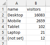
For example, if we open the ‘devices.csv’ file, we will see something that looks like this:
Here we see all the breakdown values for the ‘Devices’ dimension:
- Desktop
- Mobile
- Tablet
- Laptop
Then we see the number ‘Visitors’ (Unique Visitors in the Plausible dashboard) that correspond to each type of device.
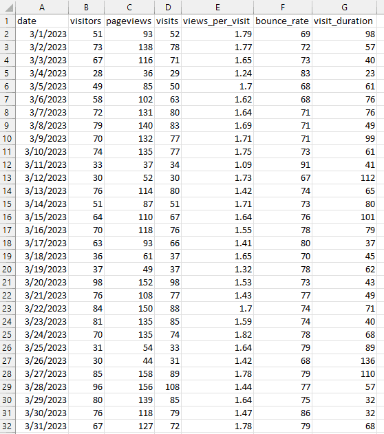
This isn’t too helpful for us in terms of importing our data into Looker Studio, as we can’t do much more than a simple breakdown chart with this data. In order to do something a bit more interesting, we can use the ‘visitors.csv’ file. This is the same data that drives the chart in the Plausible Analytics dashboard and looks something like this:
Here we have only one dimension, ‘Date’, but we have several metrics:
- Visitors (unique visitors)
- Pageviews
- Visits
- Views per Visit
- Bounce Rate
- Visit Duration
With this data, we can at least do some custom analysis based on dates. Let’s see how we can do that in Looker Studio.
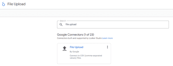
To upload our ‘visitors.csv’ file in Looker Studio, we will go to ‘Add New Data Source’ and select the ‘File Upload’ option.
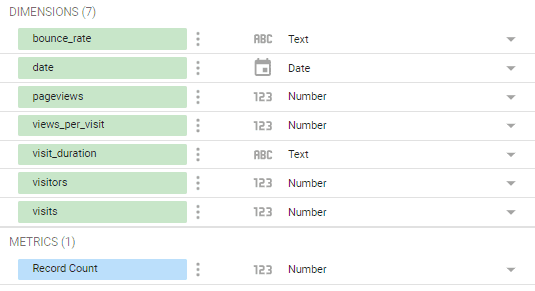
Once you do this, you will see that all of the fields from our CSV file are now available as fields in Looker Studio.
Then we will just follow the prompts to create a new report using our manually added data.
Using Manually Imported Plausible Analytics Data in Looker Studio
Now that we are in our new report where we will use our manually imported Plausible data, let’s see what we can do with it.
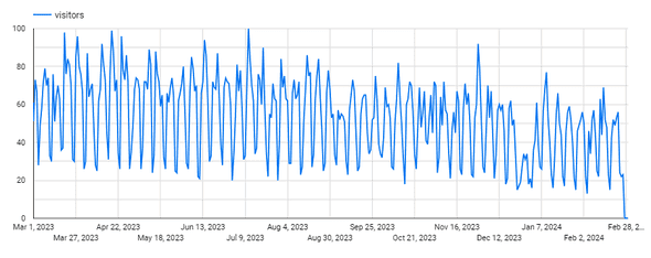
To begin with, we can recreate the chart in our Plausible Analytics dashboard, simply by selecting ‘Insert > Time series chart’ and then selecting ‘Date’ as our dimension and ‘Visitors’ as our metric.
This is what it will like in our chart setup in the right-hand sidebar:
With the result being a timeseries chart that looks like this:
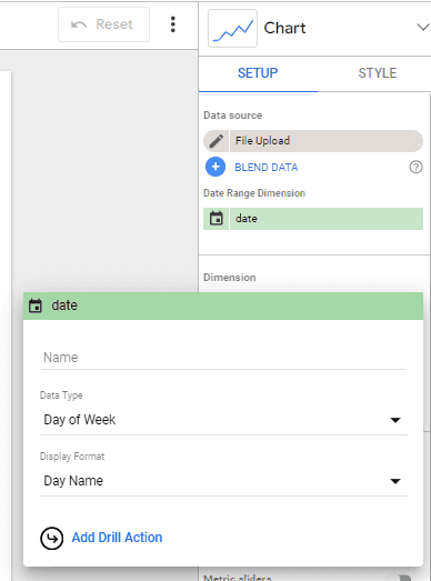
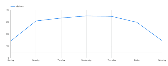
Now we can use the flexibility of Looker Studio’s data visualization capabilities to create charts that we can’t find in Plausible’s dashboard. For starters, we could look at our traffic by day of the week, by clicking on our date field and changing its ‘Date Type’ to ‘Day of Week’.
This can then show us how our traffic changes on any given weekday:
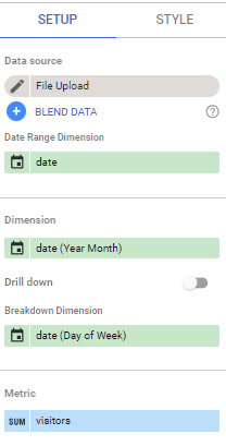
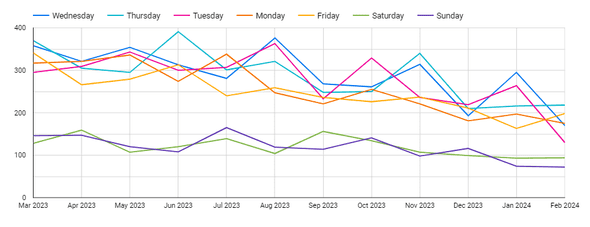
We could then see how this mix has evolved over time, by adding an additional dimension to our report for our Date formatted as ‘Year Month’. The configuration will look like this:
And the new timeseries chart will look like this:
As you can see, we now have a simple data visualization that shows us how the number of visitors to our site by day of the week has changed over the last 12 months.
You could create further variations on this theme by using different metrics, like ‘Bounce Rate’, ‘Pageviews’ or ‘Visit Duration’ and combine them onto a single report. All of these are things are not possible in the native Plausible Analytics dashboard and can be accomplished with a manual connection to Looker Studio.
Pros and Cons of Manually Connecting Plausible Analytics to Looker Studio
That brings us to the pros and cons of manually importing Plausible Analytics data into Looker Studio. This approach works well for a simple analysis where you want to look at one variable at a time. So, in our example above, where we are looking at different date breakdowns, this approach works fine. However, when we want to do a more complex analysis that involves multiple variables this approach breaks down.
On the cost front, this approach clearly has advantages, as it can be done with no additional cost. However, one thing to note is that Plausible Analytics does put limits on the amount of data you can export at one time, so that might be a limitation depending on how much data you want to analyze.
Obviously though, since this is a manual approach, it will take more of your time to upload and potentially, keep uploading data to keep things fresh on a regular basis. Depending on how you value your time, it might make more sense to go with an automated approach to connecting Plausible Analytics to Looker Studio.
If you are looking to do more complex analysis or want dashboards that update in real-time, read on to see the automated approach that uses our connector.
How to Connect Plausible Analytics to Looker Studio Automatically
Next, let’s look at how we can connect Plausible Analytics automatically to Looker Studio. To do this, we will use what’s called a Looker Studio Partner connector.
A Looker Studio Partner connector is essentially a small software service built to Google’s specifications that connects a data source’s API to Looker Studio report based on whatever fields the user selects.
You can see all of the various Partner connectors for Google Looker Studio in their connector gallery, but currently the only connector that supports Plausible Analytics is our connector.
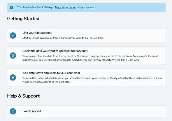
In order to connect Plausible Analytics to Looker Studio using our connector, you will first need to sign up for a free trial.
Once you’ve done that, you will go to ‘Link Your First Account’ in order to link your Plausible Analytics account to our connector.
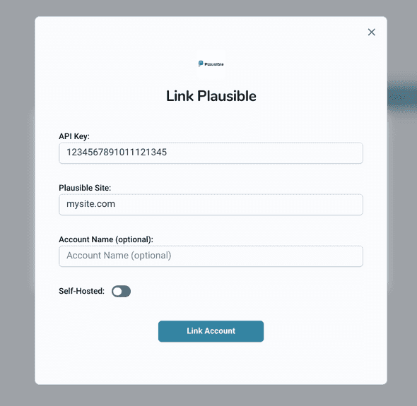
Then you will click on ‘Add Linked Account’ and select Plausible:
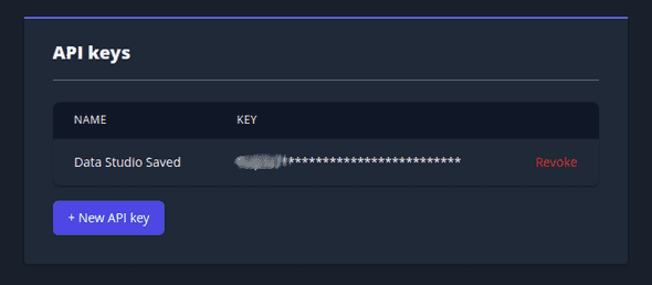
In order to link your Plausible account, you will be prompted for an API Key.
You can find this in your Plausible dashboard under Settings > API Keys.
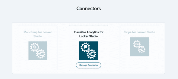
Once you’ve entered your API key and one of your Site names, you will see that your account has been linked. If you then navigate to Use Data > Connectors you will see that the Plausible Analytics connector is now active.
Before moving over to Looker Studio, we just need to make sure that the Google email address you use to access Looker Studio is added as a connector user. You can do this by clicking on Manage Connector.
Once you’ve done that, we’re ready to move over to Looker Studio. There, we simply need to create a new data source in Looker Studio using our Plausible Analytics Connector. (you can do that by following this link or by searching for Epilocal in the Looker Studio connector gallery)
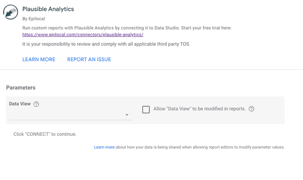
Once you authorize the connector by logging into your Google account, you will see drop-down lists that prompt you to select your Data View.
Here you will simply select from the drop-down menu the site that you added when linking your account. (Note: if you want to add additional sites, you can do that by creating additional Data Views. This is described further with more screenshots in the Getting Started section of of our documentation)
Then you can just click through the remaining prompts and we will have our Plausible Analytics data ready to work with in Google Looker Studio.
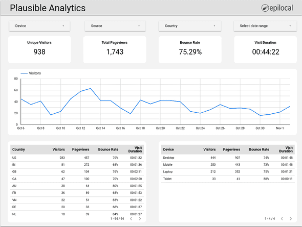
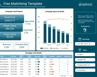
To help you get started with our connector, we have created a free Looker Studio template that replicates many of the features of the Plausible Analytics dashboard.
You can get the template for free here => Free Plausible Analytics Dashboard Template for Looker Studio.
By examining the fields and the dimensions in this template, you can get a better sense of what’s possible using our connector so you can get started right away. You can also see a full list of the fields available in the connector in the fields reference section our documentation.
Creating Complex Reports in Looker Studio with Plausible Analytics Data
Now that we have our automated connection from Plausible Analytics to Looker Studio all set up, let’s see what we can do with this data that we couldn’t do with our manual connection.
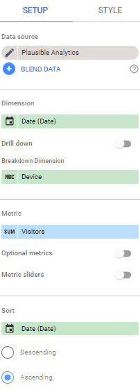
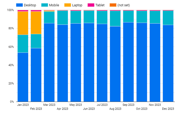
The primary difference is that we can now combine multiple dimensions in our reports, which means we can see how different breakdown dimensions evolve over time. For example, if we wanted to look at how the devices that the visitors to our site are using have changed over time, we could now do that by selecting the following as our dimensions and metrics:
- Date (Dimension)
- Device (Dimension)
- Visitors (Metric)
If we were to use these fields in a 100% Stacked Column Chart, the Setup would look like this:
While our chart would look like this:
As you can see, we now have a month to month view of how the devices our visitors use have evolved. This is not something that would be possible either in the Plausible Analytics Dashboard or using the manual CSV exports.
This same approach can be extended to many other situations like:
- Visualizing landing page performance over time (Entry Page by Date)
- Comparing landing page to exit pages (Entry Page vs. Exit Page)
- Looking at conversion types by landing page (Goal Name by Entry Page)
- Analyzing traffic source for different countries (Source by Country)
- And much more
Basically, any situation where you want to combine two dimensions into a custom data visualization is possible with an automated connection, while the Plausible Analytics dashboard limits you to what is already there and the manual export limits you to one dimension at a time.
This is not to mention all of the advantages that an automated connection provides, like additional fields that are not available in the CSV exports and the freshness of the data being ensured without any manual effort.
If you have complex analysis needs or you simply want to save time and manual effort, the automated connection is probably your best option. If that’s the case, you can find more information and sign up for a free trial of our connector here.
Wrapping Up
In this guide we looked at:
- Manually connecting Plausible Analytics to Looker Studio
- How to use manual Plausible Analytics data in Looker Studio along with the pros and cons of this approach
- Automatically connecting Plausible Analytics to Looker Studio using our connector
- How this automated connection enables more complex uses of Plausible Analytics data in Looker Studio
We hope that you found this guide useful. Here is the link to our free template one more time => Free Plausible Analytics Dashboard Template for Looker Studio
Start your free trial
Connect Plausible Analytics to Looker Studio in less than 5 minutes
Try free for 14 days![Connect Plausible Analytics to Looker Studio [Free Template]](/static/02809ee25af3e099ec53e8c6b0bf26db/388b0/connect-plausible-ds.png)

