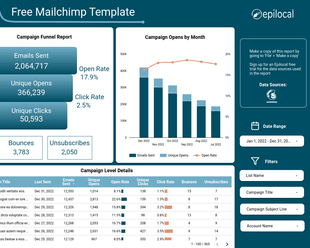
Funnel reports are very common when looking at website analytics. This is because they map very well to the journey that a user takes when interacting with a website. First, they start off at the top of the funnel as a regular visitor. Then, as they complete some action on the site, they move down the funnel, finally ending up at the bottom of the funnel when they complete the action you would like them to.
Looker Studio (formerly Google Data Studio) is a great tool to build funnel reports because it not only gives you several great options for visualizing your funnel data, but it also serves as a centralized data hub where you can easily connect data from multiple sources to build your funnel metrics.
In this guide, we will look at:
- How we can use funnel reports
- Options for creating funnel reports in Looker Studio
- Creating a funnel report with Looker Studio and Plausible Analytics
If you want to skip ahead and see the finished funnel report, you can check it out here.
How We Can Use Funnel Reports
First, let’s talk a bit about the different ways we can use a funnel report. As we mentioned above, a funnel is a great visualization for how a user moves through a website. And at the bottom of the funnel is the action that you, as the website owner, want that user to take.
So, for any action that you want someone to take on your website, you could have a different funnel report. Some examples of these would be:
- Conversions - the bottom of the funnel is people who actually bought something that you are selling
- Newsletter sign-ups - the final step in the funnel would be someone signing up for a newsletter
- Reaching a page length - the bottom of the funnel could be someone reaching a certain length on a blog post or article
In all of the above examples, you could also have intermediate steps in your funnel. For example, with conversions, you could have intermediate steps like:
- User clicked on subscribe button
- User went to payment page
Then you could have a full conversion funnel that looks like this:
- Number of users on site
- Number of users who clicked on subscribe button
- Number of users who went to payment page
- Number of successful payments
Obviously you will have less and less people who successfully complete each step. This is what creates the funnel shape, as it starts bigger at the top and gets more and more narrow until you reach the bottom.
Options for Creating Funnel Reports in Looker Studio
Now that we know what we can use funnel reports for, let’s look at how we can create them in Looker Studio. (formerly Google Data Studio) Obviously, the key to our report will be how we actually visualize the funnel itself. And in Looker Studio, there are a few options for creating funnel charts:
- Community visualization
- Horizontal bar chart
- Scorecards with shapes
Let’s look at them one by one, starting with the community visualizations. A community visualization in Looker Studio is a custom data visualization that doesn’t come by default with Looker Studio, but instead was built by someone in the community.
This means that they are not officially supported by Google and may be prone to bugs. They also have some issues when it comes to sharing reports. (e.g. the visualization may not display if the Looker Studio settings are different on the person viewing the report)
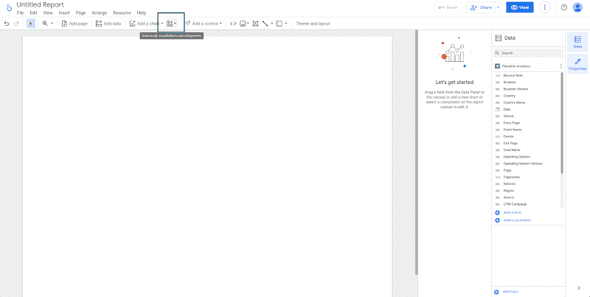
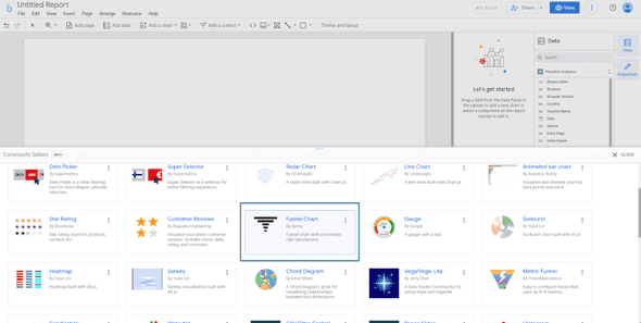
Because of these downsides, we don’t recommend using community visualizations. However, if you decide to go this direction, you can do it by clicking the Add Community Visualizations button:
And then selecting a funnel visualization like Funnel Chart by Ayima.
The next option is using a horizontal bar chart. This is natively supported by Looker Studio so you don’t have to worry about your funnel chart not displaying on shared reports. The downside is that they don’t look as much like a funnel, since you only have one side of the funnel. Also, if you want to create percentages you will have to create a second chart.
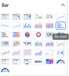
To create a funnel chart as a horizontal bar chart, we simply select Insert Chart and select Bar Chart. We will get more into the configuration options later in our example.
Finally, we can manually create a funnel chart using shapes and scorecard metrics. This option is the most flexible, as we can make our funnel chart look however we want it. The disadvantage is that our bars will not automatically adjust with our data, and we will need to do a bit more tinkering around with setting up our shapes and individual metrics.
Building a Looker Studio Funnel Report with Plausible Analytics
For our example, we are going to look at how we can create a funnel report in Looker Studio using data from Plausible Analytics. First, we need to set up our Looker Studio connector for Plausible Analytics. (We won’t go into too much detail here, since we have written this guide that explains this step-by-step)
Note: if you’re not using Plausible Analytics, don’t tune out at this point. You can replicate this report using Google Analytics or lots of other analytics providers that offer similar metrics
With that out of the way, let’s start building our actual funnel. First, let’s think about what we actually want to achieve. To keep things simple, let’s just visualize how deeply people are interacting with our website and how that leads to conversions.
Based on that, we will have three steps in our funnel, all based on the page that someone views:
- Any page view - basically this is all visitors to the site
- View a product page - someone might have visited the homepage or a blog post and then clicked through to visit a product page
- View the Free Trial start page - someone has taken the time to click all the way through to starting a free trial
Now, to visualize our funnel, we are going to use the horizontal bar chart option, so let’s go ahead and add that to our report. Using the bar chart option means that we have a bit of work to do in order to get our data into the right format.
Basically, we need a single Dimension that breaks down our data into the exact categories we want for our funnel. This means that we are going to need a Custom Field.
So, we will Click Add Field in our data source and we will create a field called Funnel Name. Then for our formula, we will use a Case statement that looks like this:
case
when CONTAINS_TEXT(Page, '/products/') then 'Product View'
when CONTAINS_TEXT(Page, 'get-started') then 'Free Trial View'
else 'Total'
end
This is just saying that in our new custom dimension, all pages that contain get-started will be given the value ‘Free Trial’, all pages that contain /products/ will be given the name ‘Product View’ and everything else will be given the name ‘Total’.
Once we have our formula for our custom field, we will simply select Funnel Name as the Dimension for our chart and Visitors as our chart’s metric. Just like that we will have a chart that looks a lot like a funnel.
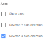
Now, in order to complete the visualization and to add percentages to our data, we will copy and paste our chart and flip our new chart on its X-axis.
Then we will change our new chart’s Visitors metric to Percentage of Max Relative to Corresponding Data.
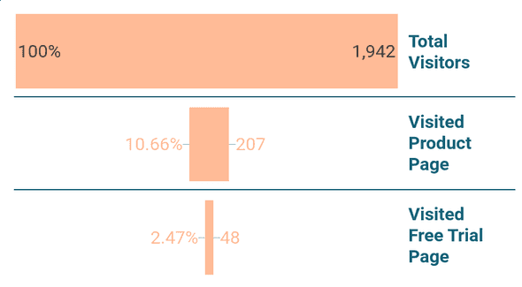
Now if we put our charts back to back, we have a funnel that adapts in size to our data and has automatically calculated percentages that gives us conversion rates.
So in our example, out of all the visitors coming to our site, 2.47% are making their way to the Free Trial page. From here, we could build out our funnel further to see how many people actually signed up for Free Trials using custom Goals from Plausible or how many people started paid subscriptions pulling data from Stripe. But for our purposes, we will leave it there for now.
Conclusion
In this guide, we’ve covered:
- How to use Looker Studio to build funnel reports
- The three different options for creating funnel charts in Looker Studio
- How we can create a Plausible Analytics funnel report in Looker Studio
If you are stuck or would simply like a head-start building your own funnel report, you can grab our free Funnel Report template.
Start your free trial
Connect Plausible Analytics to Looker Studio in less than 5 minutes
Try free for 14 days



![Connect Plausible Analytics to Looker Studio [Free Template]](/static/02809ee25af3e099ec53e8c6b0bf26db/b6d36/connect-plausible-ds.png)
