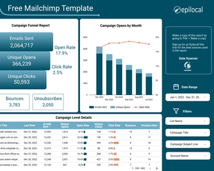
In this article, we will show you how you can create Mailchimp Comparative Reports in Data Studio. If you wanted get similar reports using Mailchimp’s built-in reporting tools, you would have to shell out for a Premium plan that starts at $299 per month. But with the techniques we’ll discuss here, we can help you get advanced email marketing analytics for a fraction of that.
So, let’s see you can create Mailchimp Comparative Reports in Data Studio while saving money at the same time.
What are Mailchimp Comparative Reports
First, let’s understand a bit about Mailchimp’s built-in reporting tools and why they put such a high price on comparative reports.
To begin with, Mailchimp does not let you look at combined results comparing one email campaign to another. You have to look at one email campaign at a time, and then try to make generalizations from there. This means that to get any sense of the big picture you have to do a lot of manual work or inexact mental math.
So, one of the first things you get with Mailchimp’s premium Comparative Reports is the ability to actually aggregate and compare email campaigns to one another.
Mailchimp’s Comparative Report tools also give you the ability to compare different segments of your email list against an average baseline:
With this you can compare the performance of all of your email marketing campaigns or newlsetters for a certain period of time or you can look at the split of different Mailchimp segments and how they compare to the average.
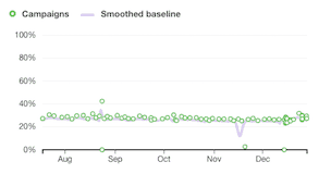
Alternatively, you can look at the performance over time in a graph:
Without a doubt, these are powerful reporting capabilities, but the price tag of $299 per month puts it way out of reach for the average small business. Let’s see what we can create in Data Studio that gives us similar insights at a fraction of the price.
Building Comparative Reports in Data Studio
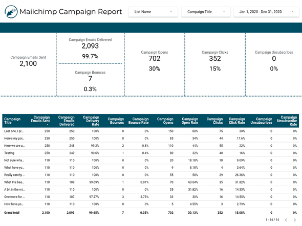
As a starting point, let’s take the report that we built in a previous guide using our Mailchimp Data Studio Connector that looks like this:
(If you don’t yet have access to our Mailchimp Data Studio connector, you can start your free trial here)
Even with this basic report, we can start looking at some comparisons that are much more powerful than what Mailchimp offers by default. In fact, we already have a baseline average in our boxes at the top, which gives us a good reference to compare our individual campaign performance to at the bottom.
But let’s see how we can adapt this so it is more like Mailchimp’s Comparative Report. So let’s get rid of all of our scorecards at the top and just focus on the table. Now, instead of looking at individual campaigns, let’s slice the data by list (or audience in Mailchimp lingo).
So we will remove the Campaign Name field from our table, and we will replace it with List Name. Now it should look something like this:
While we’re at it, let’s change the data fields so we match up completely with what Mailchimp has in their Comparative Report. So we will:
- Remove Emails Delivered, Delivery Rate, Bounce Rate, Opens, Clicks and Unsubscribe Rate
- Add Abuse Reports
Now we have a table that looks a lot like Mailchimp’s built-in Comparative Report:
The difference is that our comparison is split by List / Audience, while they are using Mailchimp Segments. This has some drawbacks, as you are limited to how many Audiences you can have based on your pricing plan and Segments are more dynamic and easier to change on the fly - but for the money we are saving, that’s not too bad!
Next, let’s see how we can recreate their chart that shows a comparison over time. We will start by inserting a Timeseries chart into our Data Studio report. Then we will add the following data fields:
- Dimension - Campaign Last Send Date
- Metric - Campaign Unique Open Rate
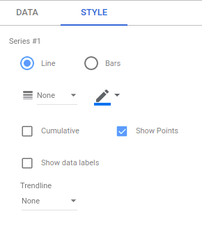
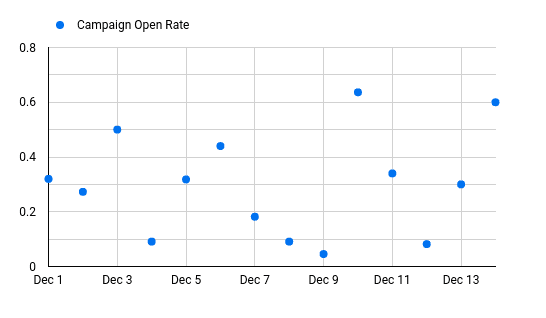
Then we will go to the style of the chart and we will make some changes so it is more like the scatter plot that we are looking for. We will change Line Weight to “None” and we will check the box that says “Show Points.”
With those changes we should now have a chart that looks like this:
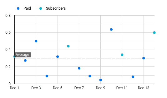
Next, let’s add List Name as a breakdown dimension and style those series with no Line Weight, Show Points, but in different colors than we had for our first series. Finally, let’s add our baseline for comparison. Under style, we will go to Reference Lines and click on the plus sign (+) to add a new Reference Line. Then we will select a type of Metric and use Campaign Unique Click Rate and for the Calculation we will use “Average”.
With that, we have a timeseries chart that shows the open rate performance of our different lists compared to the baseline:
We can then slice this however we want by adding filters to our data or by using different metrics like Click, Bounce or Unsubscribe rates.
Advanced Comparisons Using Mailchimp Member Data
If you want to take your comparative reporting even further, you can bring individual member data from Mailchimp into Data Studio using the Pro version of our Data Studio connector.
Not only does this give you your entire aggregated list in one easy-to-view place, it lets you bring together member data that is impossible to aggregate inside of Mailchimp’s default reports.
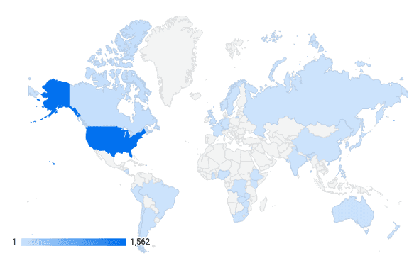
To give you an idea of what we can do with that data, let’s see how we can look at members split by Geography. We will create a new graph by going to Insert > Geo Chart.
Then for the Geo Dimension we will pick Member Location Country Code and for the Metric we can select Member Email. And automatically, Data Studio will create a chart for us that makes it very simple to visualize where all of our subscribers are by country:
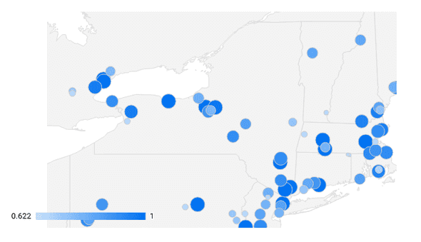
We can also change the metric here from Member Email to either Member Avg. Click Rate or Member Avg. Open Rate to see how those metrics compare across countries.
If you don’t have subscribers all over the world, you can drill down further by using Member Location Lat/Long instead of Country Code. Now you can see your member Click Rates at the state or even neighborhood level.
This could be particularly useful for a local news publication to get a sense of what neighborhoods are engaging most with your content.
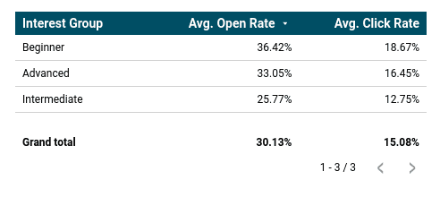
Leaving Geography aside, we can also group and segment members by Mailchimp Interest Groups. Let’s say that when we asked people to sign up for our mailing list, we asked people what their level of gardening experience was. (as Mailchimp has in their example)
We will then be able to access this from the field Member Interest Groups, so we could create a list that breaks down the Avg. Opens and Avg. Clicks for each one of these groups:
So Much More
That’s just a small sample of all the comparisons you can do in Data Studio once you’ve linked your Mailchimp account. It might not give you exactly the same Comparative Reports as Mailchimp, but you can get similar insights at a fraction of the cost.
Be sure to check out our other step-by-guides guides for our Mailchimp Data Studio connector if you want to learn more.
Start your free trial
Connect Mailchimp to Looker Studio in less than 5 minutes
Try free for 14 days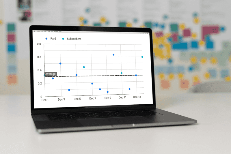




![Connect Plausible Analytics to Looker Studio [Free Template]](/static/02809ee25af3e099ec53e8c6b0bf26db/b6d36/connect-plausible-ds.png)
