We replaced our Google Analytics with the more privacy-focused Plausible Analytics almost a year ago.
For the most part, we couldn’t be happier with Plausible as our main analytics tool, but there are some things that we miss about Google Analytics. One of those things is the ability to create endless custom charts and visualizations by linking Google Analytics to Data Studio.
Now, you can also link Plausible Analytics to Data Studio and that opens up a whole new world of possibilities when it comes to creating custom charts. Let’s look at just a few of those possibilities and how you can create them in Data Studio step-by-step.
Unique Visitors by Day of the Week
One thing we find ourselves constantly doing in Plausible Analytics, is checking traffic for the current day against the same day in previous weeks. We find this to be much more relevant than just knowing how traffic performed compared to the prior day, due to traffic patterns of working days vs. weekends.
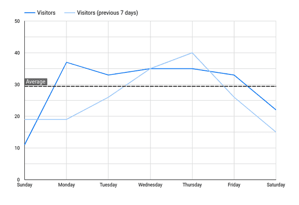
In Data Studio, we can create a custom chart that gives us this very useful information:
Here we can see by day of the week, unique visitors for the current week with overlapping data from the prior week. We’ve also added a trend line that shows the average for the current week.
Here’s how you would configure it in Data Studio:
- Create a Timerseries chart
- Set the Default Date to “Last 7 Days” with the Comparison Date Range set to “Previous Period”
- Change the chart’s dimension to “Date” and change the date type to “Day of Week”
- Change the chart’s metris to “Visitors”
- Go to the Chart Style and add a Reference line with Type: Metric, Metric: Visitors and Calculation: Average
Traffic Report
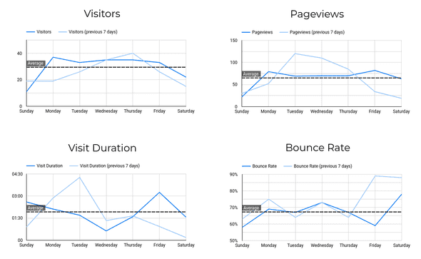
We can then expand this chart into a traffic report that shows us several key Plausible metrics at one time while comparing them to their prior week comparison:
Here you will see that we’ve added new charts now for Pageviews, Visit Duration and Bounce Rate.
These are very straightforward to set up - you simply make 3 copies of the Visitors chart from above and change the metrics to “Pageviews”, “Visit Duration” and “Bounce Rate” respectively.
Unique vs. Total Pageviews
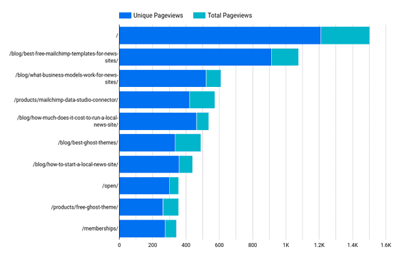
Next, we want to look at how our content is performing. Not only do we want to know what blog posts get the most views, but we want to know what posts drive new traffic and which posts have people coming back to the site to read over and over again.
In Data Studio, we can create a chart that breaks down our different site pages by total pageviews and unique pageviews:
Here we can see that the pages with the larger blue bar are driving lots of first-time visitors, while pages with larger turquoise bars are generating repeat traffic.
Here’s how we can set this up in Data Studio:
- Create a Stacked Bar Chart
- Choose “Page” as the dimension
- Add “Visitors” as a dimension and change it’s name to “Unique Pageviews”
- Create a custom metric that is called “Total Pageviews” and uses the formula “Pageviews - Visitors”
- Sort by “Pageviews”
Country Traffic Breakdown Over Time
Now, let’s look at how we can create some charts to do some longer term analysis.
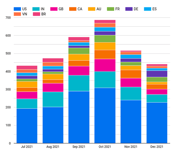
Specifically, let’s see how our Plausible Analytics traffic has changed over time from different countries.
In Data Studio, we can create a chart that looks like this:
Here we can see how our traffic has changed by month, and what countries have driven those changes.
This is how we create the chart in Data Studio:
- Create a “Stacked Column Chart”
- Add “Date” as a dimension and change the date type to “Year Month”
- Choose “Visitors” as the metric
- Add “Country” as a breakdown dimension
- Be sure to sort by “Date” and choose ascending to make sure that the months are displayed in correct chronological order
Device Mix Over Time
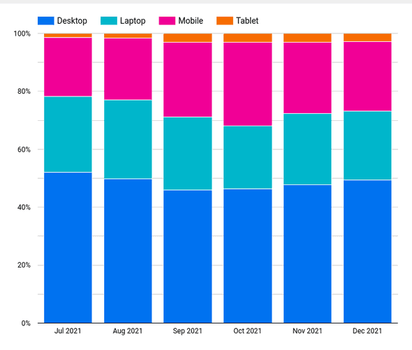
Finally, let’s see what percentage of our Plausible Analytics traffic comes from different devices and how that changes over time. In Data Studio, we can create a chart that looks like this:
With this custom chart, we can clearly see what percentage of our traffic comes from Desktop, Laptop, Mobile and Tablet devices and how that mix has changed over time.
We can configure this in Data Studio like this:
- Create a “100% Stacked Column Chart”
- Add “Date” as a dimension and change the date type to “Year Month”
- Choose “Visitors” as the metric
- Add “Device” as a breakdown dimension
- Be sure to sort by “Date” and choose ascending to make sure that the months are displayed in correct chronological order
Just the Beginning
That’s just the beginning of all the custom charts you can create with your Plausible Analytics data once you’ve brought it into Data Studio. Using our Plausible Analytics Data Studio Connector, you can create these visualizations and much more.
So get out there and start building custom charts for Plausible Analytics and feel free to let us know if there’s anything that you want help building - we are happy to give advice and write more guides on popular topics.
Start your free trial
Connect Plausible Analytics to Looker Studio in less than 5 minutes
Try free for 14 days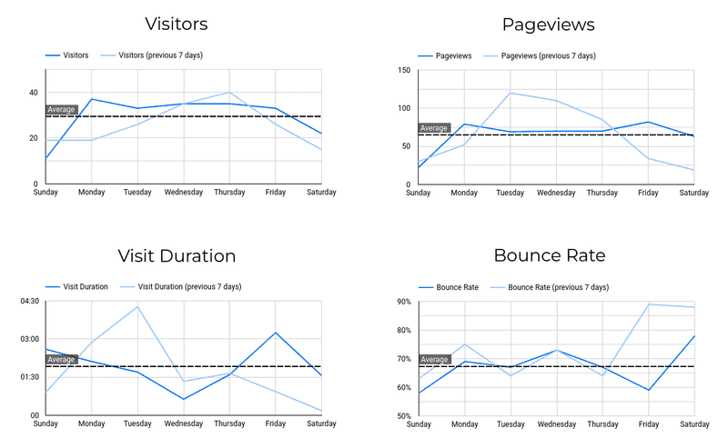

![Connect Plausible Analytics to Looker Studio [Free Template]](/static/02809ee25af3e099ec53e8c6b0bf26db/b6d36/connect-plausible-ds.png)
