We’ve written before about how important it is to build your publication around an email newsletter. And how important it is to regain control of the flow of information - that with an email newsletter, you no longer have to try to “pull” in new eyeballs with click-bait headlines every day, instead you can “push” out your content to your subscribers whenever it’s ready.
There’s just one big problem - you have to have email subscribers to begin with. For many small publications getting more email subscribers can be a big challenge.
And as we reviewed 100 local news websites recently, we observed several simple mistakes that are keep publishers from getting more email newsletter sign ups, which in turn gives them less opportunities to build an engaged audience and increase revenue.
The good news is that many of these mistakes are really easy to fix and can put a boost in your newsletter sign ups right away.
1.) Having No Email Newsletter At All
Ok, this one might feel a bit cheap but it is so important that we feel like we have to say it again.
You have to have an email newsletter in the first place and you should be making it a cornerstone of your website. But still, there were 15% of the publications we reviewed (a not insignificant number) that haven’t figured this out yet - don’t be one of them.
2.) Hidden Sign up Form
Apart from having no email newsletter, the next most common mistake that we saw was treating the email newsletter as an after-thought. This is easy to spot on a website - you don’t see a sign up form until you scroll half-way to the bottom of the homepage, and even then it is probably hidden in a side-widget somewhere.
Or maybe the sign up form is hidden in the footer of the page at the very bottom.
Or it has a separate sign up page where you can only get to the form if you click a subscribe button on the menu.
The sign up form should be one of the main marketing focuses of your website. Great sites that we reviewed had the email sign up right in their main header. They also have sign up forms at the end of every article and many had pop-up modals.
3.) Relying Too Much on Pop-Ups
Speaking of pop-ups, we observed an over-dependence and a tendency of many publications to go overboard. Pop-ups can get annoying and if you don’t have the analytics in place to know if a user has already subscribed or not, you are at risk of pushing people away for your website.
At the same time, we saw sites that had pop-up modals as their only sign up form. If you clicked out of the form and the pop-up closed, there was no other place to sign up. This is a risky strategy as there could be people browsing with pop-up blockers. In general, it’s always good practice to have multiple places to sign up on a given page.
Some of the most effective sites we reviewed used subtle pop-ups in a bottom bar or in the bottom right corner (rather than a full-screen pop-up) that are a good reminder but not too annoying to disturb the reading experience.
Then adding a couple of other prominent sign up form placements on the homepage and immediately after pieces of content is a good insurance policy.
4.) Not Selling Your Email Newsletter Enough
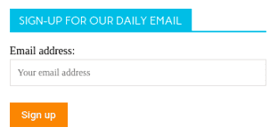
Way too often we say something that looks like this:
Or this:
If you only take one thing away from this article it is that your email newsletter is not an after-thought even if it is free - email is the primary way that you can connect with your audience and you shouldn’t be selling that short.
If you are producing a good email newsletter product then there is a really good reason that someone will want to subscribe to it. Don’t be shy - tell them what they will be getting and why they need to have it.
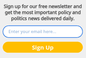
Here’s a better example of an email sign up form that really sells itself:
5.) Unnecessary Double Opt-in
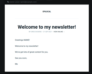
In our review we observed that close to 40% of the publications that had email newsletters were requiring new subscribers to double opt-in. This means that when you sign up on their signup form, the next email you will get is from Mailchimp, or whoever their email marketing provider is, asking that you click a button to confirm your subscription to the list.
Not surprisingly, adding this additional hoop for someone to jump through is a barrier to getting email sign ups, but what may be surprising is how big of a detractor it actually is. We have seen sources that estimate the drop-off as high as 40%. In other words, by enabling double opt-in, you have to work almost twice as hard to get the same amount of email subscribers as using single opt-in.
We understand why people are cautious and want to play it safe by enabling double opt-in. But you have to weigh doing something “just in case” against the impact that it is having on your business. Everything that we have seen written on the topic of data-privacy laws in Europe or in California points to the fact that clear language on your sign up form is all you need to be in compliance.
We won’t go too much more into the debate around double opt-in as there are plenty of other articles written on the topic - we will just close by saying any decision that reduces your email subscribers by 40% right away should have a very clear rationale, and we haven’t seen anything like that for double opt-in.

